ROADMAPS
Design Sprints were used to refine and expand upon ideas rather than just come up with one thought. These sprints still had an agenda and a facilitator but the structure was more casual and focused on solving challenges. Some sprints were short, and others went on for several hours. Team members were still focused on relevant skill sets instead of general group interaction.
MOODBOARDS
A few different moodboards were created to nail down a direction for the design. The moodboards were accompanied by a written breakdown of each direction. This final moodboard was an amalgamation of the previous three, and went through a few revisions before finalized.
DESIGN BRIEF
The Design Brief was created to describe the overall aesthetics and voice of the brand. Based on the design sprints as well as surveys, pieces of the invisible brand were put together in this brief. It included personas or profiles of potential users, demographic breakdown, mood or feeling brand should convey, personality of brand, unique features of brand, possible site names, possible taglines, imagery ideas, and possible design direction. This brief was actually broken into several smaller pieces and presented at various stages early in the process. It went through several rounds of revisions and provided the core detail to build the visual brand from.
FUNCTIONAL BRIEF
After a couple rounds of Design Sprints and Discussions, a Functional Brief was drafted to sum up the overall wishlist for the site. Included in the brief were content features, categories, promotions, functionality features, social media tie-‐in, unique assets vs competitors, etc. The Functional Brief went through several rounds of revisions and served as the starting point for developing the site.


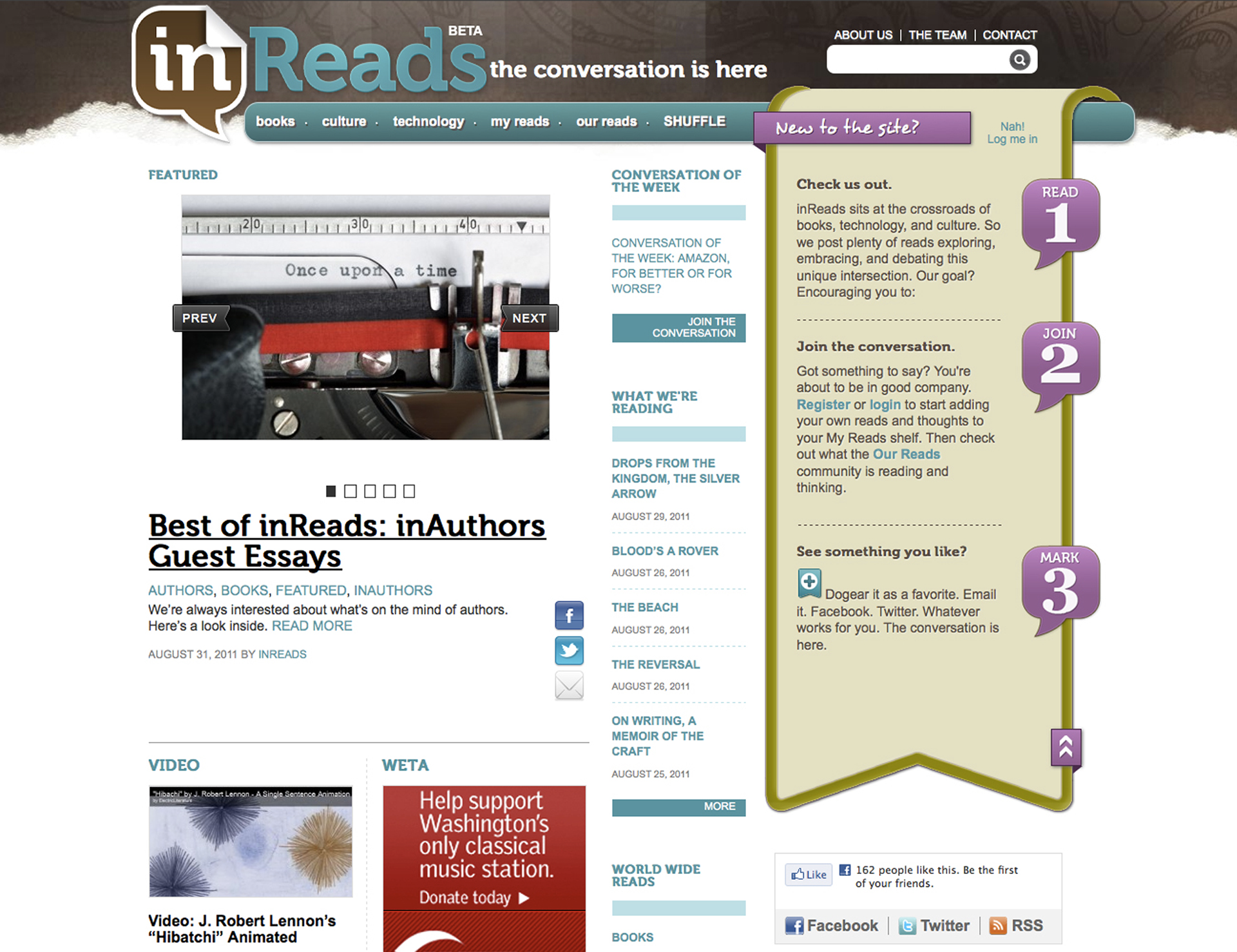
PROTOTYPE:WEBSITE
